Paul Smith started his career as a British fashion designer over 40 years ago with a desire to become a part of the art world where ideas and excitement flourish. Driven by a passion for expression and an appetite for agitation, he grew his brand into a world-renowned fashion house. His style, both in design and business, appeals to our team at POP Fuel for its next-level, trend setting and merchandise moving essence of cool. We have collected a few examples of his excellent window displays that really pump the brand’s style into retail.
Here are 3 visual merchandising lessons that we think everyone should consider:
- Product displays can be a window into a brand’s soul
Paul Smith is well known for his ability to anticipate and even inspire trends beyond the fashion world. His influences have seeped into popular culture and with window displays as simple and sweet as these leopard spotted shoes in a cage, it’s clear that his tongue in cheek style carries weight well beyond his merchandise.
- Merchandising is an art form that should provoke as well as promote
As a designer who capitalizes on every moment to push the envelope, Paul Smith sees the world through an artist’s eye. His brand clearly reflects this in nearly every aspect. I love his window display featuring a zebra with colorful stripes stepping out from his black and white facade. Although the case displays more art than merchandise, the concept expresses the idea behind this colorful collection. We immediately connect with the zebra and feel inspired to step out from our black and white covers to embrace our vibrant personalities with… let’s say a purple suit and orange tie.
- Light and warmth attracts, but contrast stands out
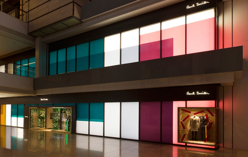
If you haven’t caught on yet, Paul Smith is big on design. His statements are always bold, yet his work never comes off as noisy. I believe he achieves this by making very precise, artistically driven decisions for every aspect of his business. Take this flagship store’s entrance for example. The 2 floors of multicolored, pastel light boxes are impossible to overlook but somehow they aren’t too distracting to become a nuisance. Rather the warm, glowing ambiance ads an attractive quality to the space both inside and outside of the shop. So how does he make his products stand out? Well, this POP merchandising genius simply features 2 window displays… in bronze!
The contrasting bronze windows create clear visual boundaries and lend the retail displays a pronounced, yet cooperative prominence to the front of the store. He then blends the color scheme together by incorporating scattered pastel panels across the windows that help partner the palettes. Ultimately, the effect is exquisite. We are first drawn to the store, then the window displays, followed by the products themselves.
Do the merchandising effects stop there? No way! This cleverly concealed store creates a certain allure by enclosing the shoppers inside. The opaque light-box-lined walls close the shop off from the outside, creating a retail experience that looks, and feels, like its own world. Paul Smith has done a great job establishing his brand and takes it to the next level with store designs that pump the same mojo into the shopping experience. Boasting merchandising skills that are just as sharp as his fabric sheers, we expect to see Mr. Smith continue to set the bar for all things design.
Thanks for reading! Click here to Subscribe.
You can also connect with us on Facebook, LinkedIn & Twitter.


