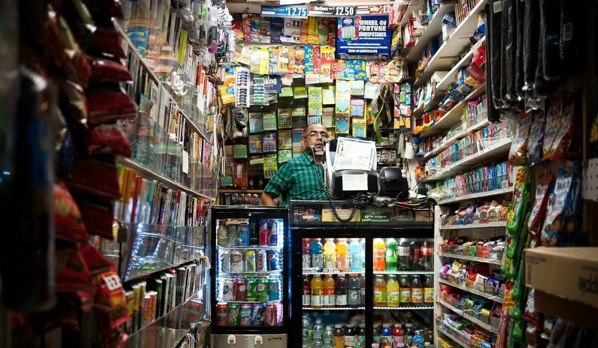
They say that small is beautiful. While that may be true, a small retail store can be a challenge in terms of displays. That’s especially true if you carry a broad product range.
Small spaces, lots of products is a challenge for many retailers, but visual merchandising has some key principles which can be supportive of retailers meeting that challenge.
Keep it simple.
Small dogs are known to sometimes bark excessively, in compensation for their diminutive size. The same may be said of some small retailers.
Coating the front of your store with signage is a surefire way to turn off potential customers. Using amateurish signage, inexpertly applied, is another way.
The exterior of your store tells people passing by a story about the texture of your brand. If you’re yelling at them in letters 10-feet-tall, then you’re trying too hard.
Keep your windows focused, but evocative and your signage, branded and simple. Say what’s necessary to draw customers inside and no more.
Clear sight lines.
When customers enter your store, they should see a clear trajectory for their exploration of it. That means keeping your sight lines clear. That’s especially important if you’re a small retailer.
Piling merchandise to the ceiling on crowded, tall shelving is not the way small spaces should manage lots of products. For one thing, it overwhelms shoppers. For another, it’s claustrophobic. Sooner or later, either you or your customers are going to lose it.
Instead of tall shelving, use those walls! They’re one of the small shop owner’s best friends. By using the perimeter of your outlet, you’re creating the illusion of space. Stick to smaller displays, keyed to your brand. Opt for unusual display options like vintage shelving, ladders and small tables for feature displays and utilize slatwall on the perimeters.
Slatwall creates numerous display opportunities for small spaces. Using accessories which make the most of your walls, you keep your sight lines clear and your customers in their comfort zone – instead of assaulting them with an overabundance of product.
Customers need their space.
Have you ever been in a store which was so crammed with inventory, that you were continuously bumping into it, or feeling it brushing against you?
That is not a pleasant customer experience. That’s why it’s so crucial to leave ample space for your shoppers to move around your small store with ease. As we’ve pointed out above, that means using that valuable real estate represented by your walls.
It also means displays which are scaled to available space, with traffic routes planned around them. This will help you display as much product as possible, without driving your customers from the outlet, after having been repeatedly “assaulted” by what’s in store.
Small spaces, lots of products demand visual merchandising which rises to the challenge. By creating the illusion of more space, using concise, professional signage and by getting the most from your walls, the petite presence of any storefront can be amplified.
Clip Strip Corp. designs and manufactures superior retail POP supports for small stores like yours.

