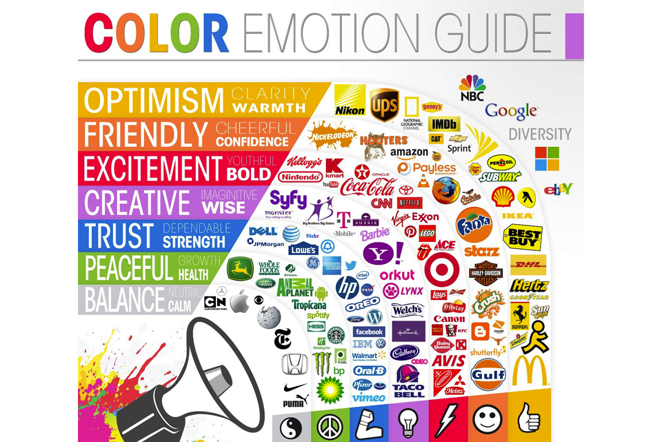
Did you know that the average customer typically makes up their mind about a brand, product or store within 90 seconds of their first encounter? Considering that 62-90 percent of a first impression can be based on colors alone, how will the colors chosen for your brand, product or store influence a shopper’s perception? According to Satyendra Singh of the Department of Administrative Studies at the University of Winnipeg, Canada, “managers can use colors to increase or decrease appetite, enhance mood, calm down customers, and, reduce perception of waiting time, among others.”
While the range of claims regarding the psychological associations between colors and human feelings is vast, we believe a few theories might help brighten up your point of purchase display marketing strategy.
Here are 3 of our favorite ways to use color at the point of purchase:
- Use colors in retail to influence emotions
Retail stores tend to have several options for injecting color at the point of purchase. Everything from the interior walls to your promotional signage and product packaging can help set the mood with the right color scheme. Of course personal experiences and connections with colors won’t be consistent enough to guarantee a correlation with specific emotions, but we do know that when used in the correct context, a lit bit of strategic product merchandising color can go a long way.
During a study that tested for associations between colors and emotions, Cimbalo et al (1978) determined that yellow, orange and blue have tendencies to promote feelings of happiness. Contrarily, red, black and brown tend to be ‘sad colors.’ This should be kept in mind when creating retail displays, decorating interiors or deciding on product merchandising details. Be sure that the colors help contribute to the overall desired atmosphere or mood of the campaign. A well-balanced, holistic approach might make your promotions even more effective.
- Evoke feelings in brands with color associations
Humans are hard-wired to respond to certain colors in nature. This has helped us recognize markings on dangerous critters such as poisonous amphibians, insects and reptiles. Although colors have been linked to certain emotional responses, our point of purchase marketing strategy and product merchandising efforts must consider that everyone’s experience with colors still varies widely. This means we can’t expect a single color to evoke a specific feeling in every single person. We can, however, leverage broader associations linked to color perceptions in our branding efforts. Think about Coca Cola’s distinct red logo, McDonald’s yellow ‘M’ or Nickelodeon’s orange, splatter logo. These brands are all tapping into the innate emotional influences that color has on human perception.
In a study titled, The Interactive Effects of Colors, Paul A. Bottomley and John R. Doyl of the Cardiff Business School, UK found that the relationship between brands and color hinges on preexisting associations between color and product/service type. The perceived appropriateness of the color being used for the particular brand reflects on industry standards, which aim to line up product types with color types. For example, sensory-social products might receive inherent and immediate brand value simply by utilizing sensory-social colors such as . When the color fits the product type our heuristically driven brains have an easier time creating a whole picture to associate with the concept in our memories.
- Control how customers perceive time with color and lighting
According to Singh, red light has been reported decrease the perceived speed of time. Theoretically, red tinted lighting and décor should make everything seem to move slower and appear larger than in reality. It has also been found that blue light does the opposite, causing objects to appear smaller and time to pass quicker than in actuality.
These color and lighting schemes can be seen in restaurants of all types. Fast food restaurants often favor red colors and light because it stimulates appetite and metabolism. Another popular choice within the industry seems to be yellow, which can catch customer’s attentions and increases appetites. The desired effect is to increase average order value and decrease time at the table.
More formal establishments within the restaurant industry require a different psychological mood to maximize customer visit value. These restaurants tend to create an atmosphere that is calming and invites customers to stay and relax. The business objective here is larger order value, which will happen naturally as the customers remain at the table. This comforting state will ultimately encourage patrons to order larger meals, additional drinks and possibly dessert. To increase your chances to capitalize on up-selling in a formal restaurant, try to bring in a bit of blue light. Be careful not to overdo it with too much blue as this can actually cause your customers to feel tired and lose their appetites.
When your trying to decide how best to leverage a few new shades of color into your marketing plan, remember that the other aspects of the retail store, restaurant or product packaging must be appealing. The context of these colors will also be very important as they can change how shoppers perceive your materials. Remember that good service, high quality, and contextually sound surroundings will speak volumes to your customer’s subconscious mind. Once again, the buying journey must be well balanced so that all product merchandising efforts will harmoniously merge together in a next-level shopping experience.
Thanks for reading! Click here to Subscribe.
Click here to return to POP Fuel home page.
References
Cimbalo, R.S., Beck, K.L. and Sendziak, D.S. (1978), “Emotionally toned pictures and color selection for children and college students”, Journal of Genetic Psychology, Vol. 33 No. 2,
- 303-4
Bottomly, P.A. and Doyle, J.R. (2006), “The interactive effects of colors and products on perceptions of brand logo appropriateness”, Marketing Theory, Volume 6(1): 63-83
Singh, S. (2006), “Impact of Color Marketing”, Management Decision, Vol. 44 No. 6, 783-789


